I chose the brief for my Final Minor Project to be 'Good News'.
The initial problem is that there is not enough good news shared in the media today. Through research, questionnaires and interviews with journalists, I found out that 'scaremongering' is often use to sell newspapers because good news 'does not sell'. People are more intrigued by a catastrophic event rather than an inspiring story.
Yet I found out that over 90% of people still would like to see, hear and read about good news more often. Positive news articles are more likely to be shared on social media and have been proven to uplift people's moods.

I began by looking at what is already out there. Dedicated good news websites and apps already exist as platforms where positive news articles are collected all into one place. The problem I seen with this was that a mass audience would not go out of their way to download a good news app/ go on a good news website themselves, due to the fact that people are more interested in finding more shocking or catastrophic stories.

I came up with concepts inspired by the '100 Happy Days' positivity campaign, and decided to create a type of 'Adventure' app. The idea was that people can go out and find their own good news, acting as journalists/adventurers. They would be sent a pack containing a journal, camera and a back pack. After filling in the journal full of their new 'discoveries', it could either be sent off and featured/shared on a website and social media, or it could be passed on to someone else to fill in their good news findings and read past ones from other people.
After testing this and asking a few questions, I found out that people would not be interested in going out of their own way to get good news. People want something easy and in their face, much like the media is today eg. Facebook news feeds, Twitter, on TV and everywhere on the front pages of magazines and newspapers. So people need and want something that they don't have to go out of their way to get.

After going back to the drawing board, I decided to type in the word 'news' on an online thesaurus just to see what would come up. The word 'scoop' sparked my interest as it also resembled a scoop of ice cream as well as news and gossip. I then started to roughly sketch out the word using thicks and thins to resemble ice cream, and scooped, curvy shapes. I then thought, 'good news doesn't sell, but ice cream does!'
An Ice Cream Cafe titled 'The Scoop', dedicated to bringing people positive, inspiring, creative and uplifting stories by selling ice cream. These articles could be put on the ice cream packaging, on the cones, tubs, menus, the walls, the shop windows, the website etc.
I also liked the idea of getting the community involved. By sending in their own positive stories through the use of the Ice Cream Cafe's website/Twitter/Facebook etc. they could have their articles featured on the packaging or in the cafe some how. This would also be a good way of keeping the news constantly updated within the cafe.

I then started to develop the brand. I wanted the logo to represent ice cream. I experimented making my own logotype, using thick and thin lines to resemble melting ice cream. I then came across a typeface called 'Gelato Script', which fit the theme perfectly. The flick on the 'P' character also resembles a spoon/scoop shape, which fitted in nicely with the title.
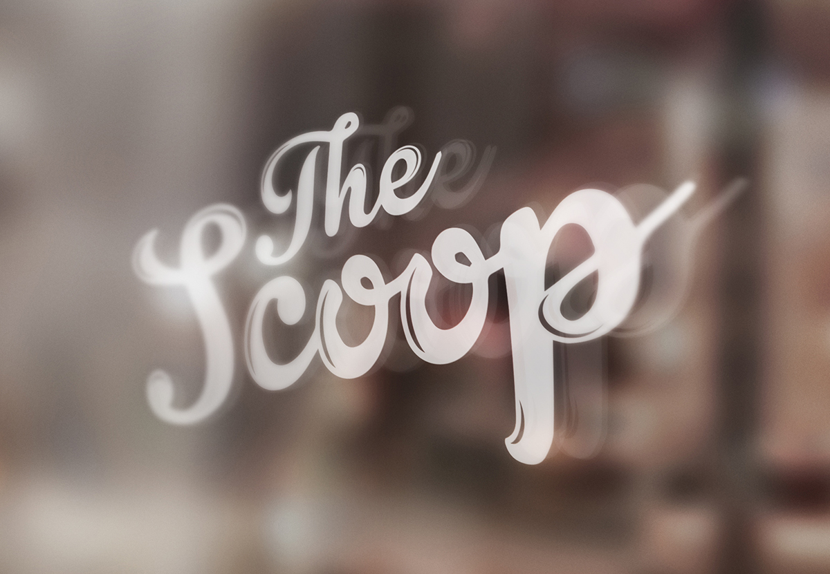
This is the final logo design. I decided on keeping the colour neutral, as then it can be applied to a number of different colours for different flavours on things like the packaging etc.

For the packaging I was inspired by the ice cream brand 'Joe's Ice Cream'. The way their packaging is purely type I thought would be a good way to show all the different news articles/short snippets on the ice cream tubs and cones themselves. By using a grid system, I could work out what good news segments could go where, what 'tweets' from the community would go where etc. and maybe to mix it up with some flat colour vector illustrations just to keep it looking fun and modern.
I also thought it would be nice to seperate the good news sections into ice cream flavours and colours.
Yellow = Humour (Vanilla, Banana, Orange flavours)
Pink = Inspiring (Strawberry, Raspberry, Candyfloss flavours)
Green = Nature (Mint, Green Tea, Apple flavours)
Brown = Science (Chocolate, Caramel, Cookies & Cream flavours)
Pink = Inspiring (Strawberry, Raspberry, Candyfloss flavours)
Green = Nature (Mint, Green Tea, Apple flavours)
Brown = Science (Chocolate, Caramel, Cookies & Cream flavours)
So depending on which ice cream flavour you choose, you would get positive news articles from different news categories. This would keep things fresh, people would not see the same news over and over and it also would persuade people to try different flavours.

Ice Cream Cone labels.
Chocolate = Science
Strawberry = Inspiring
Mint Choc Chip = Nature

I wanted the website to reflect the brand's minimal, modern and fun style. I thought of having a scrolling, easy navigational website with an about page, menu, share page and contact page.
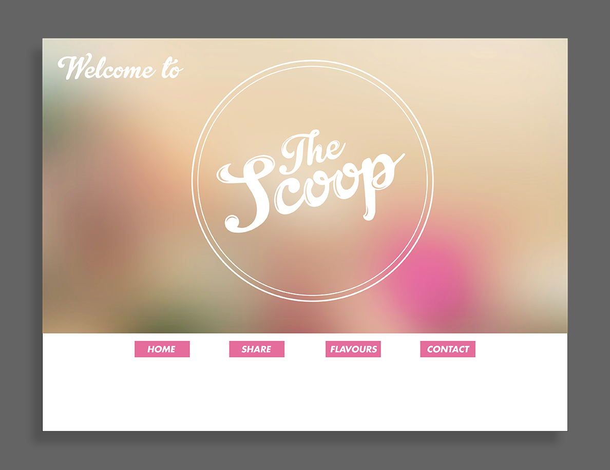
Home page.
Background is a blurred picture of ice cream. I used the colours in this picture as the colour palette for the navigation bar.

About Page.
Minimal, fun typographic style. Colours are fun yet flat and modern.
I thought it was important to have an ''Our Story' section, as the news/cafe concept is quite unique and would need to be explained to people clearly.
The 'Your News' section would explain how people can get involved and send in their own positive stories to be featured on the packaging/tubs/cones within the cafe.

Share Page
People have the option to either type out their good news story here and submit it directly, or use social media to send in shorter, summarised versions. I thought it was important to include a news feed here so that people can see what other good news stories are being sent in. This gives is a social communication feel to the project, like everyone is getting involved.

Contact Page
Minimalistic, clear and easy to understand.
Colours used represent the news sections.

Menu pages.
Use of minimalistic, flat colour vector illustrations of each ice cream give the viewer a rough idea of what to expect when ordering a particular flavour. I also think that the style appeals to the modern day society. Use of bright colours against white makes it fun yet still has a level of maturity.

The menu for the cafe I thought should represent the style of the packaging, website and logo that I had developed so far.
The menu would be laid out like a newspaper, using the title 'The Sundae Times' as a pun, to keep a lighthearted feel to the cafe. The front cover would be a news article about 'The Scoop', explaining what it's all about and how you can get involved with the speading of positive, uplifting stories.


